5 keys in web design that you should know
June 28, 2021
Table of contents
Quick Access
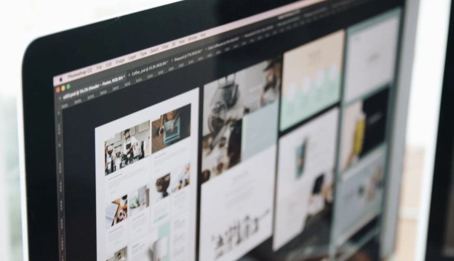
Web design is one of the main aspects when creating an ecommerce or website. It is decisive to attract a potential customer, retain him and that he makes a purchase in your virtual store. Just as you must pay attention to the architecture of the website, this structure must be complemented with a good UX design to provide an excellent user experience to visitors.
If a user enters a website and is not comfortable with its design or navigation, it is unlikely that they will return to this site again. According to Toptal statistics, at least 88% of online shoppers will not return to a website that has had a bad user experience. That is why it is so important that a website offers an optimal experience from the first moment. In addition, 94% of the time, the first impression about a brand or company has to do with the design of its website.
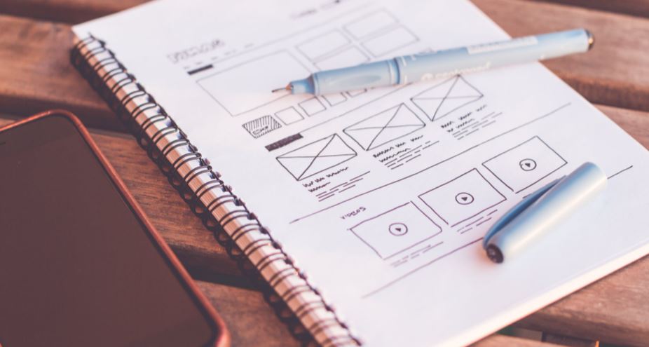
It is for these reasons that, when developing a website or creating an ecommerce, the company must be clear about the functionalities it wants on the platform and the location of the visual elements, so that it can define the design of the website with a technology partner.
Key aspects in web design
Several aspects must be taken into account for a successful, effective web design and that the company can have the best results after its implementation.
- Responsive
All website design should be responsive. What does this mean? That the web page is perfectly visible on any type of device, whether the user enters it from a laptop, desktop, tablet or smartphone. It is especially important that users can access websites or ecommerce through their cell phone, since mobile traffic has increased rapidly in recent years. Statista reported that in the first quarter of 2021, 54.8% of global website traffic was generated through mobile devices.
- White spaces
Don't be afraid of white space in web design. Although companies want to have a website full of functionalities and different components that attract more and more users, the phrase "less is more" applies here: in many cases, an overloaded site will scare away potential customers as they will feel fatigued. A correct use of blank spaces can be more effective than you think.
“White space is the area between design elements (…) it is a great tool for balancing design elements, effectively organizing content, and improving the user's visual experience,” explains the Interaction Design Foundation.
- Color scheme
The choice of the color palette for a web design is an arduous task and another of the most decisive: it depends on the colors that the user can identify your brand or company. This palette, in addition, must create a friendly and comfortable environment for the user, so that they feel comfortable and not fatigued.
In this sense, you can evaluate with a web designer what color palette you want to apply on the website: if it is monochromatic, you can use a single color and its different gradient tones; if it is analogous, it is appropriate to use shades that are very similar to each other, such as red and orange or blue and purple; You can also apply a complementary palette that, as the name implies, uses colors that create a contrast such as yellow and purple. Also consider using a triad style palette, where a dominant color and two other contrasting ones are combined, thus creating a balance.
- Visual hierarchy
It is about studying very well the elements of web design and their arrangement on the site, since that determines the influence they will have on users who subsequently enter the web page. Here's how Adobe explains it: "By using principles like contrast, scale, balance, and more, you can help set each element where it belongs and help the most important elements stand out". With a correct hierarchy, for example, you can lead the user to certain areas of the website, whether you want to increase sales or lead conversions.
- Simplicity
A web design based on simplicity can be more effective than one with an excess of elements that only hinder the user's navigation and disperse their attention. It is about the website interface showing the necessary elements for the user, neither more nor less. According to the Fearless Flyer website, which specializes in design, this simplicity improves the readability of the website, guides the user to areas of interest and allows them to get what they are looking for on the site faster. All of this creates a positive user experience.
Before taking the digital leap with your company, it is essential that you look for the best technology partner. At Rootstack, we have the most experienced web developers and designers, who can advise you and help you create the most powerful and functional website for your business.